Websites for Mobile Devices
A large percentage of visitors to your site will be using a mobile device, such as a smartphone or tablet. You will have to take into consideration how your site will look on such small screens. It is extremely important to provide the same easy, intuitive experience to your mobile users that you do your desktop users.
Real World Example
Let’s take a look at one of the top 10 websites in the world, Wikipedia, and see how they handle the issue…
First we’ll look at the site on a desktop. As you can see in the graphic below, there is a lot of text and information presented on the screen. There is a navigation bar on the left side of the page, along with two columns of content. Thankfully, we have a very large screen on which to view everything.
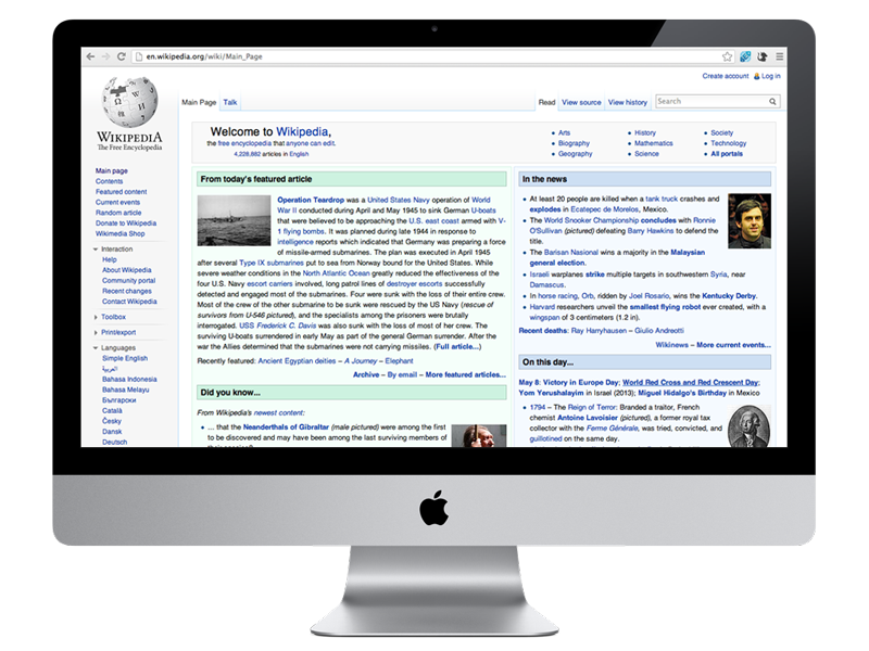
Wikipedia viewed on a desktop.
For comparison, let’s look at the site on an iPhone. Below are two screenshots of the same webpage.
The view on the left is the desktop version of the site. Notice how small and cramped the text is on the screen. Of course, the user can manually zoom in on the content, but this is awkward and very often results in accidentally tapping a link. This makes for a poor user experience.
The view on the right is the mobile version of the same page. As you can see, this is a much cleaner and more usable version of the site. The logo has been removed, the navigation is still available by “toggling” the icon in the upper left, and the search bar is very prominently featured. The content is then displayed in only one column, using a larger font with more space in between lines. This creates a very comfortable reading experience for the user.
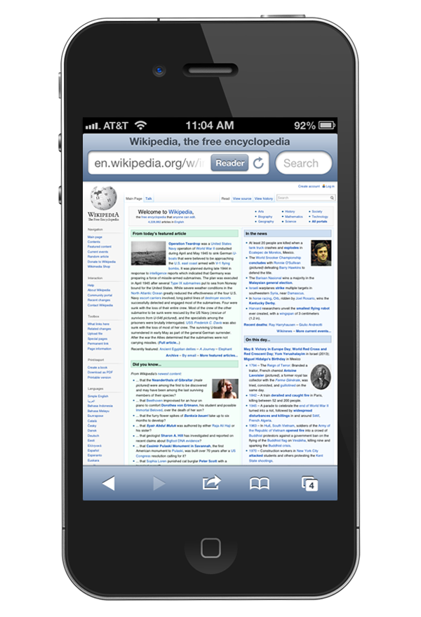
Wikipedia viewed on an iPhone – Desktop version
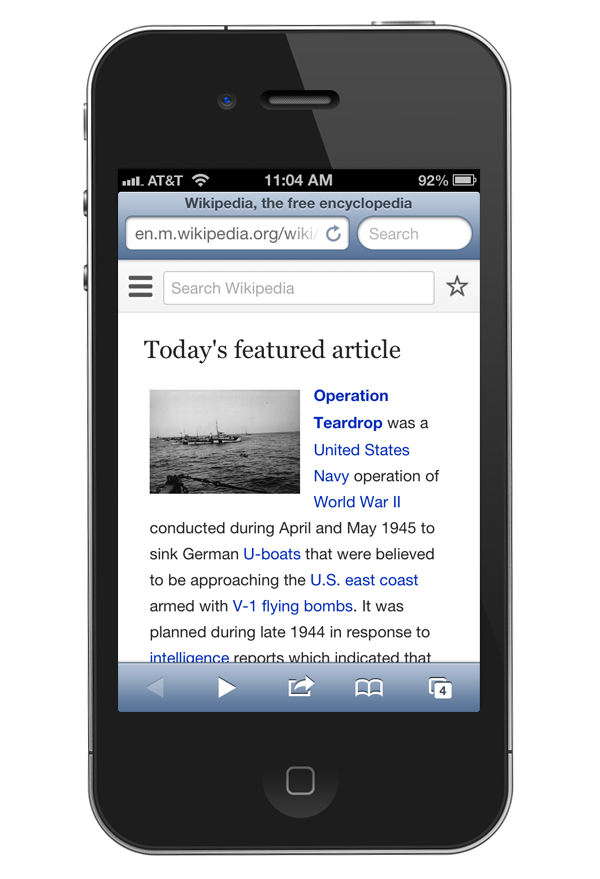
Wikipedia viewed on an iPhone – Mobile version
How to Go Mobile
You have several options available to you. If your website is simple and does not contain much text or images, you could simply display the full desktop version of your site to your mobile users. In most cases however, your site will be very difficult to navigate on a smaller screen.
One solution to this problem is to design a completely separate site that will be displayed on mobile devices. This is a good solution and provides a great experience for the end user. However, as you can imagine, it is quite expensive to build and maintain two separate websites for the same domain name. This is not a cost effective way for most small businesses to operate.
An alternative solution is what is called a “responsive” website. This means that your website will “respond” to the size of the device on which it is being viewed. Your site may hide non-essential graphics, display in a single column as opposed to a main content area with a sidebar, show a modified navigation structure, etc. We develop responsive websites for our clients that want to provide the best possible experience for their mobile viewers.
Mobile (Responsive) Website Add On
If you are having a new site designed, now is the best time to add responsive functionality. When the desktop and mobile versions of a site are developed simultaneously, the result is a very seamless experience for the end user. Our Mobile Website Add On is available for new sites only.
If you have an existing site that you would like to make responsive, please contact us to discuss your options.


